Theme Customization
How to customize the app's colors and screen elements to match your event.
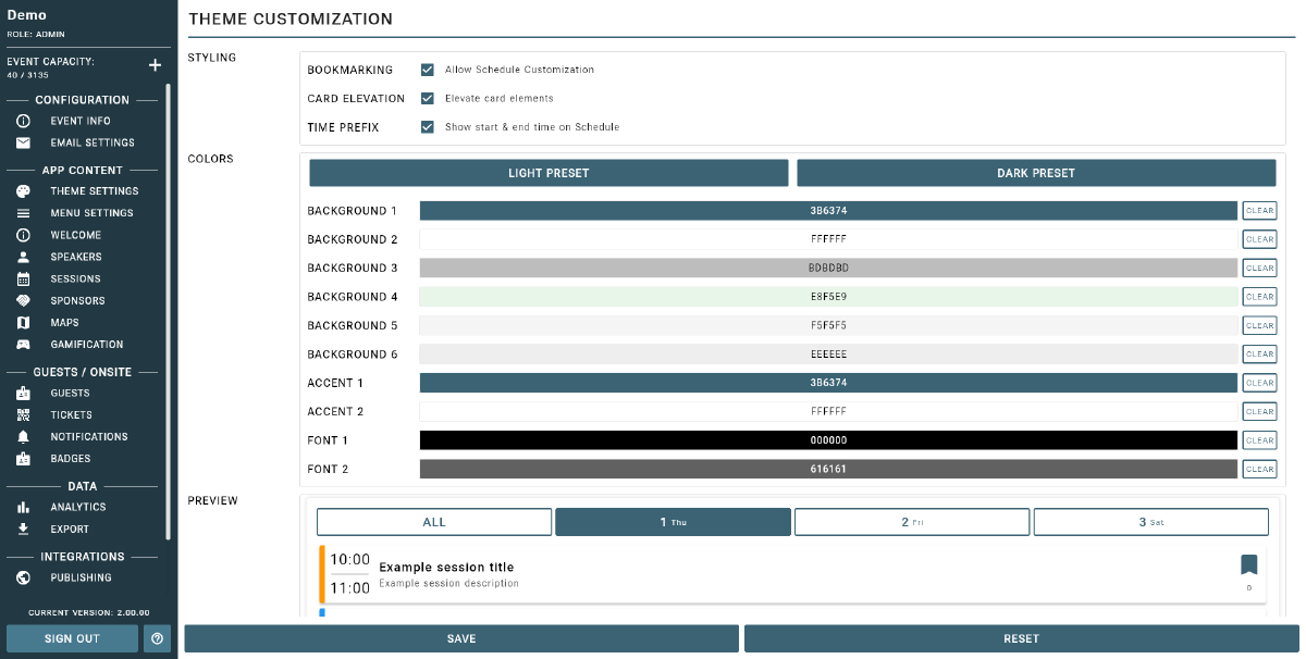
Event Vault lets you fully customize the look and feel of your attendee app to match your event brand. All color changes apply immediately across all app screens.
Color Settings
In the Theme section of the Management Console, you can configure the following colors:
- Primary Background — the main screen background color used throughout the app.
- Secondary Background — the background color for secondary panels and card containers.
- Card Background — the background color for individual cards and list items.
- Border Color — the color used for dividers and borders between elements.
- Primary Accent — your main brand color, used on buttons, active states, and highlights. This should match your event’s primary color.
- Secondary Accent — a supporting accent color for secondary interactive elements.
- Primary Font Color — the main text color used across the app.
- Secondary Font Color — the secondary or muted text color, used for labels and supporting text.
Changes to any color setting apply immediately across all app screens.
Schedule Appearance
Toggle the Schedule Customization on to apply your color choices specifically to the event schedule view. Additional options include:
- Card Elevation — adjust the shadow depth on schedule session cards (higher values create a more prominent raised appearance).
- Show Session Time — toggle whether the session start and end time is displayed on schedule cards.
Tip
Theme customization helps you create a seamless, branded experience for your attendees.
Tips
- Use your event’s official brand colors for a professional and consistent look.
- Preview changes in the app before your event goes live to ensure everything looks right.
- Hide unused features in Menu Customization to keep the app clean and focused.
For advanced theme options or help with custom branding, contact support.